


| Volume 31 Number 2 | Stony Brook, NY | < February 2019 > |
 |

|
|
Academic Research Evening 2019
Elliott Bennett-Guerrero, MD
This year’s Peter Glass Academic Research Evening will be held on Tuesday, May 14, 2019 at the Charles B. Wang Center from 3:30 - 8:30 pm. Please mark your calendar! Our Keynote speaker is Evan Kharasch, MD PhD, Professor of Anesthesiology and Vice-Chairman at Duke University; Editor-in-Chief of Anesthesiology. We invite you to submit one or more abstracts of your research for this event. An email will be sent out detailing the abstract submission process and due date. |
|
February Calendar
Wed. February 6. Dr. Sana Na Javeed will present her Senior Grand Rounds at 7:00 am in Lecture Hall 5, Level 3. Thurs. February 7. Journal Club at 6:00 pm in the HSC Galleria. Wed. February 13. Dr. TJ Gan will make the State of the Department presentation at 7:00 am in Lecture Hall 5, Level 3. Wed. February 20. Dr. Diana Escobar will present her Senior Grand Rounds at 7:00 am in Lecture Hall 5, Level 3. Wed. February 28. Dr. Rishimani Adsumelli will chair the Quality Assurance meeting at 7:00 am in Lecture Hall 5, Level 3. |
|
STARS: STaff Appreciation and Recognition

Dr. Deborah Richman wrote to Dr. Gan:
I wanted to share with you what an incredible experience the mission to the Philippines was last week. I felt privileged to be part of it. I am incredibly proud of our residents who went the extra mile, stayed late, were ultimate team players and maybe Stony Brook Anesthesia proud. Drs. Kseniya Khmara (now peds fellow in Denver), Demetri Adrahtas and Michael Khalili all consistently presented better kids to the PACU than any other anesthesia team member. Working in the PACU teaches a lot about the level of expertise and professionalism of anesthesia providers. I can’t say enough good things about the three of them. Well done! 
Patient comments about our Ambulatory Surgery Center staff from the Press Ganey questionnaires (compiled by Marisa Barone-Citrano, MA): The nurses were excellent. Also the anesthesiologist were FANTASTIC. I have the nerve blocker and they explained everything and implemented it perfectly. Everything was "very good" - from when I walked in door till I walked out!! I loved I got to meet dr, nurses, anesthesiologist all before procedure & everything was thoroughly explained |
|
Kudos
Dr. Stephen Probst has been promoted to Clinical Associate Professor. Steve graduated from Stony Brook Medical School and did his residency here in our department. In 2008, he joined our faculty. Steve is the Chief of the Neuroanesthesia/ENT Anesthesia Division. Congratulations! Dr. Christopher Page has been promoted to Clinical Associate Professor. Chris also graduated from Stony Brook Medical School and did his residency in our department. After a Fellowship in Pain Medicine at New York Presbyterian Hospital, he became a faculty member in 2007. Chris is the Division Chief for Acute Pain. Congratulations! Dr. Francis Stellaccio has completed the requirements for ABA re-certification. Congratulations!   
|
|
Welcome!
Joseph Gnolfo III, DNP, MS, ACNP, CRNA 
|
|
Elliott Bennett-Guerrero, MD 
|
|
Research News
Grigori Enikolopov, PhD
A paper on which we are co-authors, has been accepted to Nature. The title is “A radical switch in clonality reveals the formation of a stem cell niche in the epiphyseal growth plate”. The paper was reviewed as an Article, and I hope that they will preserve it as such (it becomes quite usual for Nature to tell the authors at the end of the long review process to condense an Article to a regular Letter format). This study, performed by a team at Karolinska Institute in Stockholm, used our triple S phase labeling for birth-dating stem cell cohorts, in this case in the growing bone. It shows that there are two different strategies in the organism for bone growth. During fetal and perinatal periods, when there is rapid longitudinal bone growth, the pool of chrondrocyte progenitors is used extensively and is almost depleted, but later, in parallel with formation of the secondary ossification centers, chrondrocyte progenitors acquire capacity for self-renewal and symmetric division and start producing large and stable monoclonal columns of chondrocytes. Identification of this switch may be relevant for developing therapies for children with growth disorders. |
|
Journal Club
Rany Makaryus, MD
“Finding Your Patient’s Inner PEEP” Dr. Melia McManus will be presenting on the advantages of using individualized PEEP settings optimized specifically for each patient, while Dr. Ehab Al Bizri will be presenting on the use of “PEEP-step” to help identify the best PEEP for a patient. You might be asking, “What’s wrong with a PEEP of 5, what is “PEEP-step” and who came up with that?” If so, then join us for Journal Club right here at the Stony Brook Galleria in the HSC. We will be answering those questions and multiple others. Dr. Shaji Poovathoor will be moderating the discussion. When he realized that this was going to the topic, his response was, “This is good. Very Good. I love PEEP!” With that said, it is certain that we will have a great Dinner and Discussion that evening! |
|
Family News
Ellen Steinberg, MDThe Steinberg family had a very eventful end of December. Our daughter, Rina graduated a semester early from the University of Michigan and will begin her job as a Management Consultant at KPMG in the summer. We have paid our last college tuition!! Our youngest son, Jonathan was married to Blair Chizner on December 29 in Boca Raton. He is doing his medical residency at University of Miami, Jackson Memorial. Blair is a Pediatric dentist. The next day, our oldest son, Alexander became engaged to Niaomi Eisenstadt! Our middle son, Ezra received his first promotion at CB Insights. We have a lot to be thankful for. |
|
India Travelogue
Srinivas Pentyala, PhD
Sankranti, one of the biggest Indian festivals, is celebrated in the month of January. It is a three day harvest festival during which the entire household celebrate by wearing new clothes, flying kites, cooking traditional food items, drawing “Rangoli” (artwork) not only in the house but also on the streets, arranging bonfires, rooster fights, decorated ox circuses, family reunions and many more fun things.
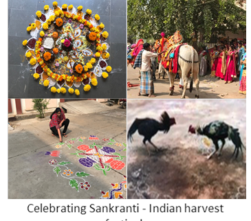
Particularly the women in the Indian household spend lots and lots of money on shopping (silk and gold). The best things about this festival is that a son-in-law is treated like royalty and showered with gifts (mostly cash). I love being at my in-laws place at this time (even though I am considered an “old” son-in-law, after 27 years of marriage), as I am always showered with gifts (not going to reveal how much cash I received this year!!!). All this cash was spent by my wife and daughter to buy – you know what. My daughter had the best time meeting the extended family and participating in every traditional ceremony, especially drawing Rangoli. |
|
New Publications
|
|
Synaptic Communication: Violins at the Super Bowl
James P. Dilger, PhD
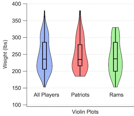
I've been studying the violin recently. Actually, I've been looking at the violin plot, not the instrument. I've become a big fan! Okay, I know this sounds like a really nerdy topic, but try to stay with me. It all started with a project I was doing with the high school student Sarah Adamo (now a freshman at Northeastern U) whom I've written about before. Her experimental data on sea anemones was not normally (bell shaped curve) distributed. This required particular statistics (nonparametric) for analysis. That was not a problem. But the question was how to best display the results graphically to compare datasets.
Rather than getting into the details of her data, let me illustrate this with something with decidedly international appeal. Let's consider the weights of the 106 players (53 on each team) on the active rosters of the two Super Bowl teams this year: New England Patriots and Los Angeles Rams. Here is a histogram showing the distribution of weights. This is most definitely not a bell-shaped curve! While the average is about 246 pounds, it ranges from 153 lbs (Rams' wide receiver JoJo Natson) to 380 lbs (Patriots' offensive tackle Trent Brown). Even I, a football agnostic, get the idea. Some players have to be nimble and quick, others have to resemble a brick wall. Stats people would say that the histogram is bimodal. 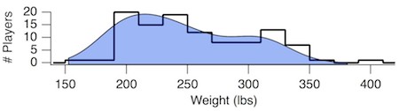
An alternative to the histogram is to plot each point along with a bar showing the median value (recall that there are as many points above the median as there are below). Because the average does not tell us too much, you might be inclined to include the standard error of the mean (SEM). As you can see, that's not useful at all. The standard deviation (SD) provides a bit more flavor of the wide range of values observed, but does not reflect the asymmetry of the distribution. In the 1970s, statistician John Tukey increased the information content when he introduced the Box and Whisker Plot. The top and bottom ends of the box represent the 25th and 75th percentiles of the distribution, the center line is the median (50th percentile) and the whiskers extend out to the full range of the dataset. Thus, our 106 data points can been reduced to five descriptive numbers in an easy to understand graph. However, this still does not capture the bimodal nature of the distribution. 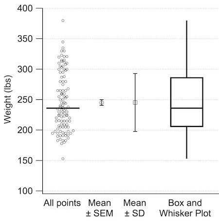
|
|
Where on Campus is That?
James P. Dilger, PhD
|
|
Monthly Muscle Chillaxant
|
|
SleepTalker, the Stony Brook Anesthesiology Newsletter is published by the Department of Anesthesiology
Stony Brook Medicine, Stony Brook, NY Tong Joo Gan, M.D., Chairman Editorial Board: James P. Dilger, Ph.D.; Stephen A. Vitkun, M.D., M.B.A., Ph.D.; Marisa Barone-Citrano, M.A.; Richard Tenure, M.D. |